
Dark Theme - CSS Migration
Dark theme is out now! Let those eyes rest.


DeveloperHubbers rejoice, we now have a dark theme 🎉
The dark theme extends throughout the documentation pages, API references, landing page and the search functionality.
It is possible to set the dark theme by default for your readers, and also to provide them with a toggle in the top navigation for them to change it.
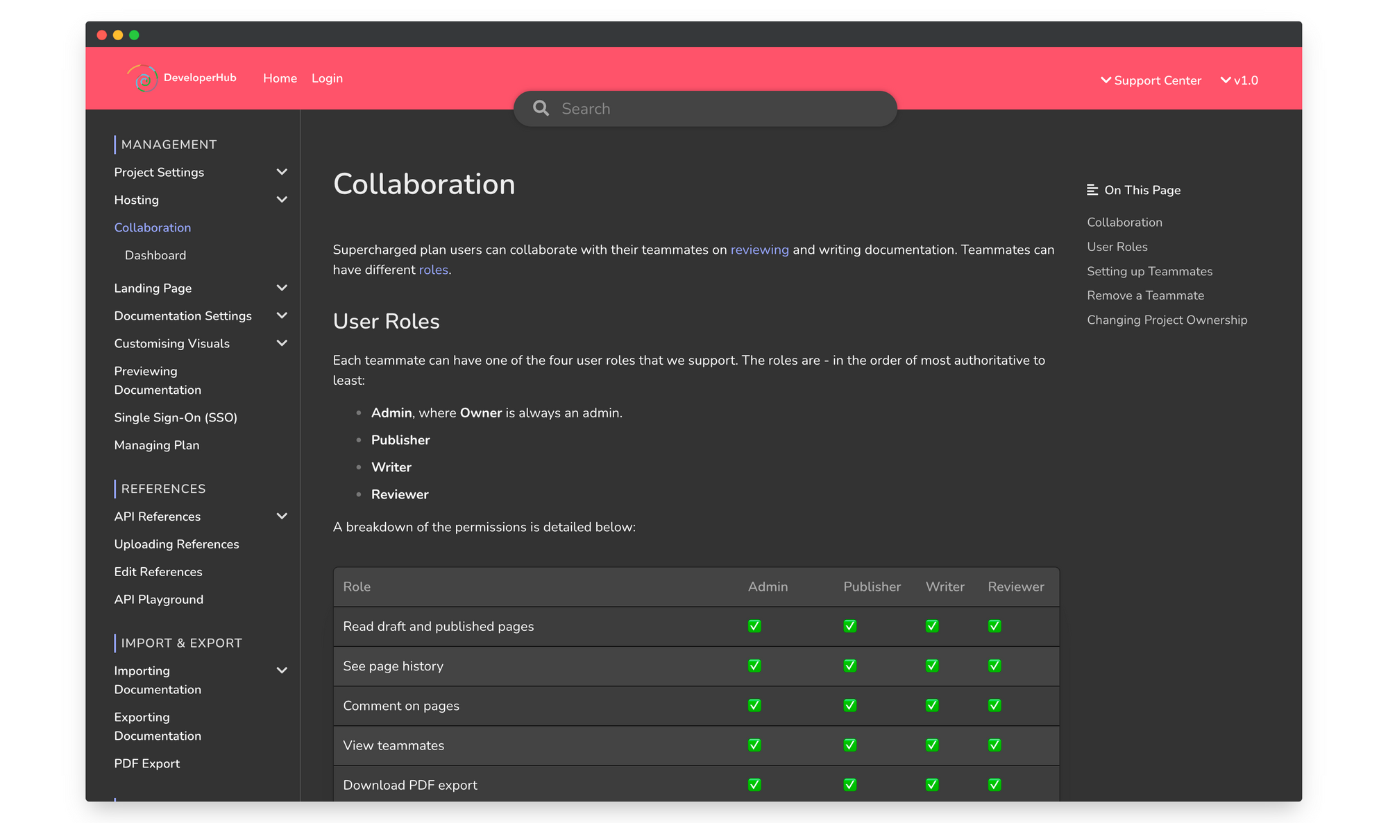
Here's how it looks:
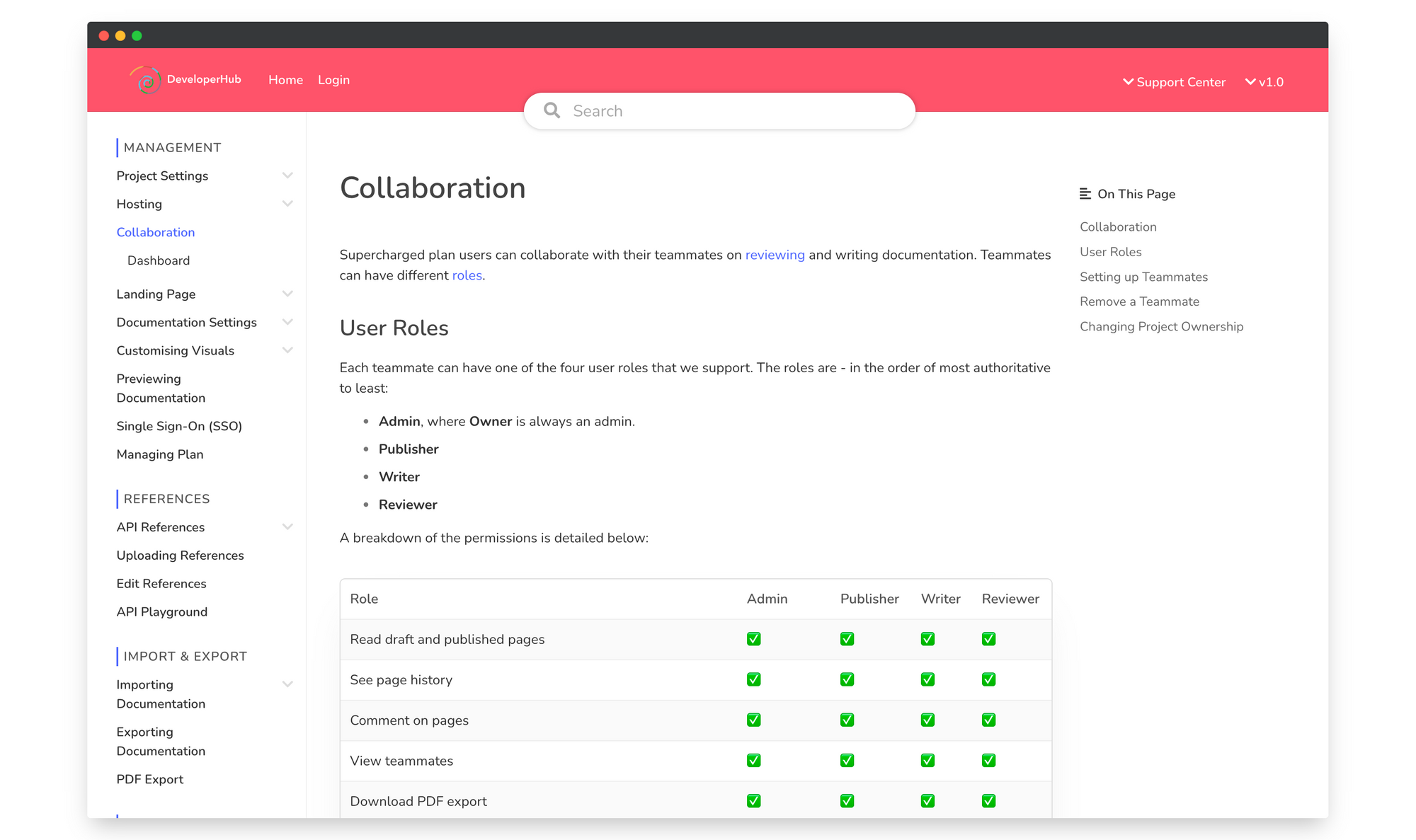
And the same page in light theme:
Great, how can I use it?
To enable dark theme, you can select it from the "Edit Colours" control at the top right.
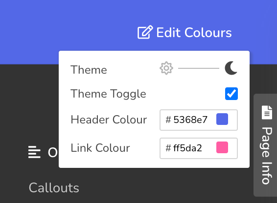
Check Theme Toggle if you wish to enable your readers to be able to modify the theme for themselves too.
If you have heavy custom CSS modifications, then you might need to test the existing CSS changes and make changes accordingly. See the Q&A below.
Migrating CSS
To test dark mode on readers' site without saving the setting on the project, open your DevTools and run the following code in console:
window.setTheme('dark');

// Revert with window.setTheme('light');
At this point, feel free to make draft CSS changes. Once you're confident of the changes, publish the CSS changes and set the dark theme as default.
Customising CSS
Our CSS has had a good clean up during the creation of the dark theme. With the introduction of dark theme, we have added more CSS variables that control the look and feel which you can modify.
  --bg-color: #FFF; /* Background color */
  --alt-bg-color: #FFF;  /* Used in some controls for differentiating from background color in dark mode */
  --font-color: #333; /* Font color */
  --heading-color: #444; /* Heading color */
  --category-color: #555; /* Category (in index) color */
  --toc-link-color: #666;  /* TOC text color */
  --table-second-color: #FAFAFA;  /* Alternating table background color */
  --page-border-color: #F1F1F1;  /* Left and bottom page border color */
  --inline-code: #444444; /* Your inline code color */
  --inline-code-bg: #f5f7f7; /* Your inline code background color */
When dark theme is activated, a class .dark-mode is set on document.body which causes the variables to change. Most of the visual changes happen due to the variables change, and only a few other changes are due to specific CSS rules which are applied when .dark-mode is set.
Q&A
Q: Editor looks funny even though I do not have dark theme enabled. How can I solve that?
A: This is probably because you have changed the background/font colour directly using CSS previously (not using the new variables), and have not used the .customise.live selector as in the best practices. Remove these CSS rules to fix it.
Q: My header and link colours do not look good in both light and dark themes. Can I set them up individually?
A: Yes. Set up the colours as usual using the Edit Colours control for light theme, and add the following CSS to change the colour when dark theme is used:
.dark-mode {
  --brand: yellow;
  --link: red;
}
Q: I already have created a dark theme using CSS. Can I keep using mine?
A: While it's possible to keep using yours, we highly recommend that you use our own. That's because 1. Our product is ever-changing and you would need to keep customising your own CSS for dark mode when new features are introduced, 2. Some users do not like the dark theme and would prefer to use the light theme, providing them with a toggle would make their experience better on your docs.
Furthermore, if our exact dark theme colours are not what you need, you can now directly modify them using the CSS variables above.
Q: My frontend application version has been pinned. What do I do now?
A: We pin your frontend application version if you have heavy CSS modifications and we suspect that our CSS is going to conflict with your custom CSS which then would degrade the readers experience. See how to migrate to latest application version. Contact us if you needed further help.